Introduction
 Hello! Welcome to the Tornado Prediction Center! I am Ms. Whirlwind, the CEO here at TPC in Kansas, and I need your help! Our computers have crashed, and our Data and Prediction Department needs help analyzing and comparing some of our data about tornado occurences that have happened in the past decades and in most recent years. This information is vital in order to help make predictions for upcoming tornado seasons!
On this quest, you will compile, sort, and analyze data about tornado frequency from a chosen state in the U.S. You will create 3 charts that will compare data from the years 1960-1970 and 2004-2014, and you will use your data and charts to make predictions and justify your reasoning.
Here are some of the Common Core standards that will be addressed along the way:
S-ID: Interpreting Categorical and Quantitative Data
Summarize, represent, and interpret data on two categorical and quantitative variables:
5. Summarize categorical data for two categories in two-way frequency tables. Interpret relative frequencies in the context of the data (including joint, marginal, and conditional relative frequencies). Recognize possible associations and trends in the data.
6. Represent data on two quantitative variables on a scatter plot, and describe how the variables are related.
- Fit a function to the data; use functions fitted to data to solve problems in the context of the data. Use given functions or choose a function suggested by the context. Emphasize linear, quadratic, and exponential models.
- Informally assess the fit of a function by plotting and analyzing residuals.
S-ID: Making Inferences and Justifying Conclusions
Make inferences and justify conclusions from sample surveys, experiments, and observational studies:
4. Use data from a sample survey to estimate a population mean or proportion.
6. Evaluate reports based on data.
Click the "Task" tab to continue... your help is crucial!

Task
The Tornado Prediction Center needs you to pick a state in the U.S. and analyze the data we have on tornado occurrences between the years 1960-1970 and 2004-2014. We could analyze all of the data from 1960-2014, but there's not enough time to analyze everything! By taking these samples, we can still make accurate observations and predict trends in tornado occurences in the future! Click the "Process" tab to continue!
Process
Part I: Compiling, Sorting, and Organizing Data
Note: The following directions include an example of an analysis done for New York.
1) Select a state you would like to analyze. Submit your choice by October 15, 2014. To ensure everyone analyzes a different state, your choice will be confirmed in class on October 16, 2014.
2) Go to tornadoproject.com and select your state.
3) Upload all of the data for every county of your state into excel. When uploading the data, remember to use the techniques we reviewed in class in order to be as efficient as possible.
4) Sort the data from 1960-1970 by year and month, followed by data from 2004-2014 by year and month. Again, remember to use the techniques you were shown in class to increase efficiency.
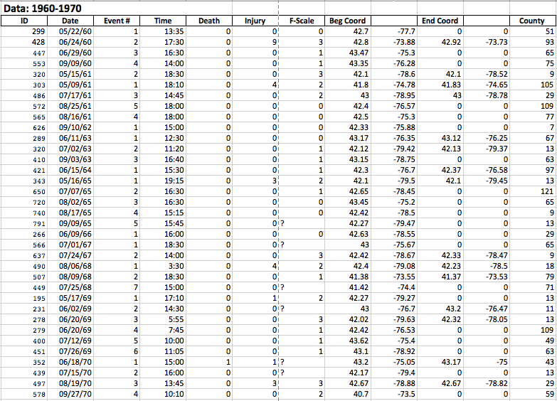
QUESTION: Observe your sorted data. What trends do you see? Make a prediction about the change in frequency of tornados between the years 1960-1970 and 2004-2014.
5) Sort the data by month for the years 1960-1970 and 2004-2014.
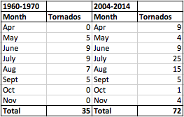
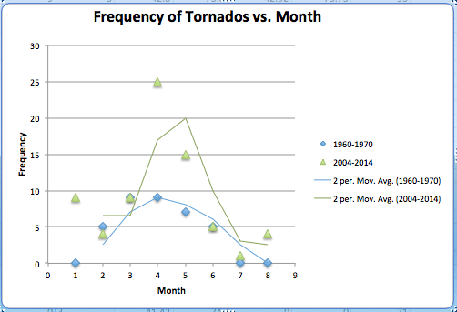
6) Using the data from the previous step, create a scatter chart with a moving average trendline using the month as the indepedent variable and the frequency of tornados as the dependent variable.
7) Using the same date from step 5, create a scatter chart with a linear trendline and display the linear equation and regression statistic.
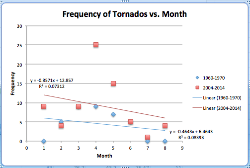
QUESTIONS:
- Is the linear trendline for the scatter chart a good choice? Include the regression statistic to justify your reasoning.
- For this particular data, which do you think is a better choice: the moving average trendline or the linear trendline? Justify your reasoning.
8) Create another chart of your choice (i.e. column, line, bar, etc.) with the same data. The following example uses a bar chart:
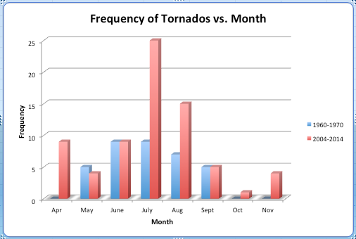
QUESTION: How does your chart of choice compare to the scatter chart? Which chart is preferable for this data? Include pros and cons of both charts.
Part II: Analysis
In addition to the questions from Part I, answer the following questions:
- Analyze the scatter chart and your chart of choice. How does the tornado prevalence for your state in the past decade compare to the prevalence in 1960-1970? How does your prediction from Part I compare with the results from the charts?
- What factors do you think could have contributed to the conclusions you have drawn in the previous question? Justify your reasoning.
- Calculate the percentage of increase or decrease in tornado frequency for the 2 decades you analyzed. Recall:
- Based on your conclusions from the previous 3 questions, what prediction can you make about the frequency of tornados 50 years from now?
- If we had included an analysis for the years 1971-2003, what trends might have we seen in frequency? Justify your reasoning.
- Make 3 additional observations from your data or charts. Consider time, F-scale rating, coordinates, etc.
- Did you notice anything else interesting while compiling and analyzing your data?
EXTRA CREDIT: Explore one of your additional observations from question 6 in part II or another curiosity that you have as a result of this project. Your exploration should include additional data or a further analysis using a chart, outside source, etc. The minimum requirement for this extra credit assignment is 150 words.
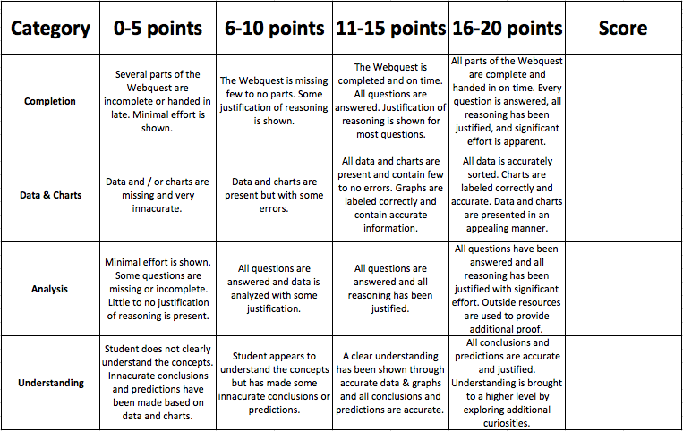
Evaluation
You will be graded based on the following criteria: